

Elliðaárstöð
A website for Elliðaárstöð: an old power station in Elliðaárdalur, now a place to learn, explore and spend the day outdoors.
Vefur Elliðaárstöðvar: gömul rafstöð í Elliðaárdal sem er orðin staður til að fræðast, skoða og njóta útivistar.
Challenge Áskorunin
Elliðaárstöð is the old hydroelectric station in Elliðaárdalur. Orkuveitan runs it as a place where energy, nature and history meet in the middle of Reykjavík. It draws families, walkers, school groups and anyone curious about where the city’s water and power come from.
The website had to serve all of them: plan a visit, find a trail, bring a class, read the history or see what is on. It also had to work for visitors who do not read Icelandic.
Elliðaárstöð er gamla rafstöðin í Elliðaárdal. Orkuveitan rekur hana sem stað þar sem orka, náttúra og saga mætast í hjarta borgarinnar. Þangað koma fjölskyldur, göngufólk, skólahópar og allir sem vilja vita hvaðan vatnið og rafmagnið í borginni koma.
Vefurinn þurfti að þjóna þeim öllum: að skipuleggja heimsókn, finna gönguleið, koma með bekk, lesa söguna eða sjá hvað er á döfinni. Hann þurfti líka að nýtast gestum sem lesa ekki íslensku.
Approach Nálgunin
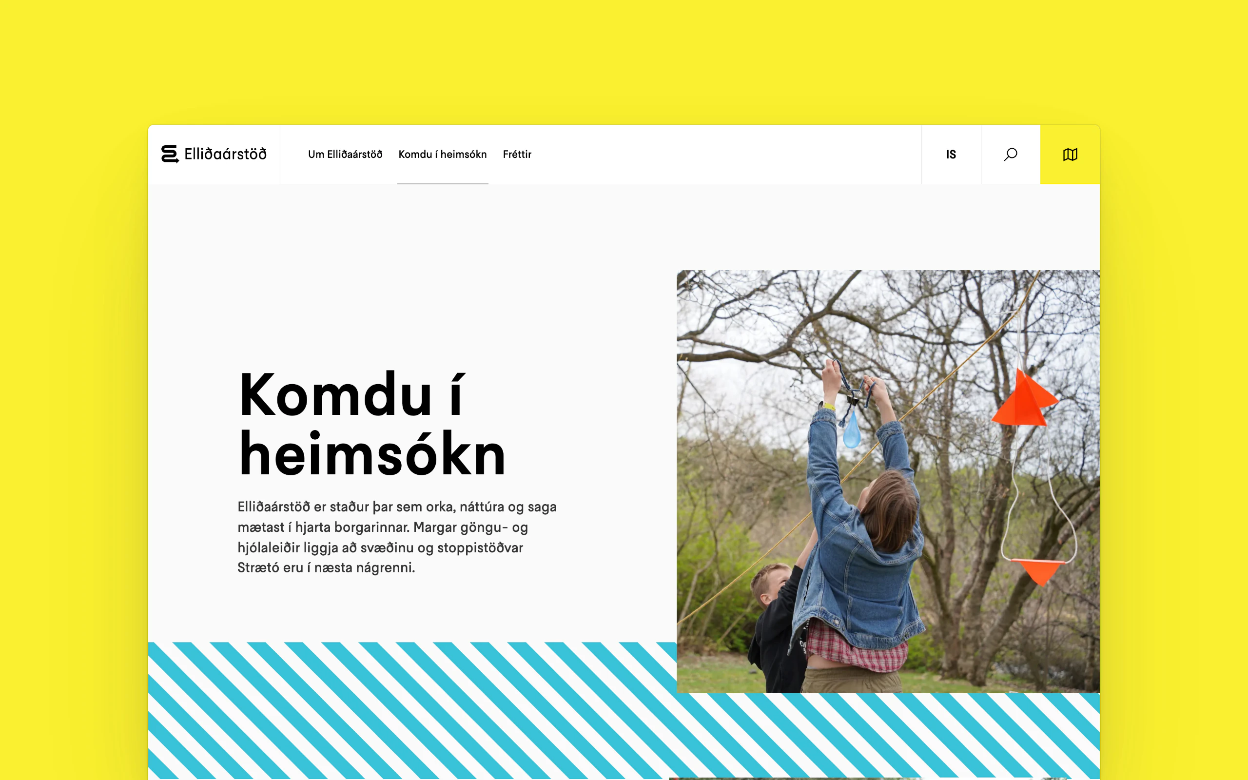
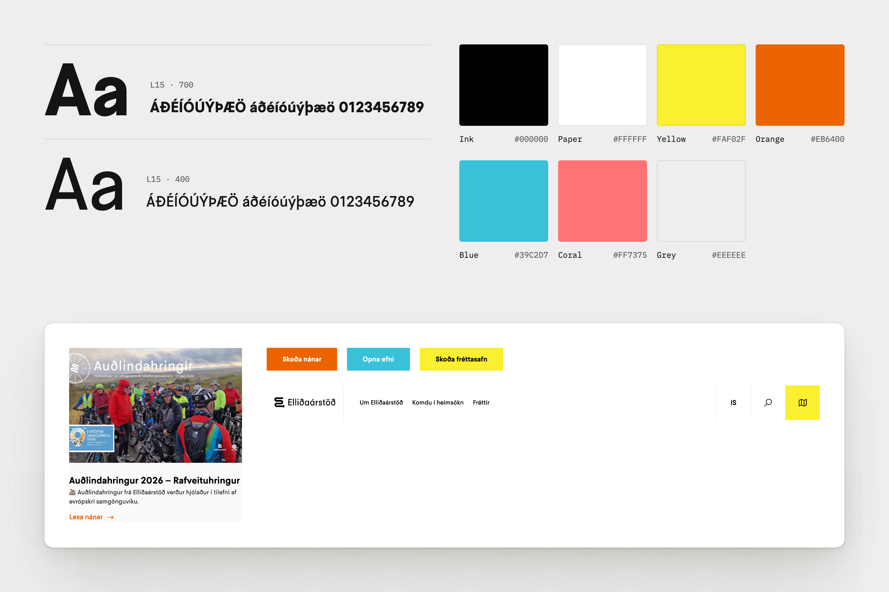
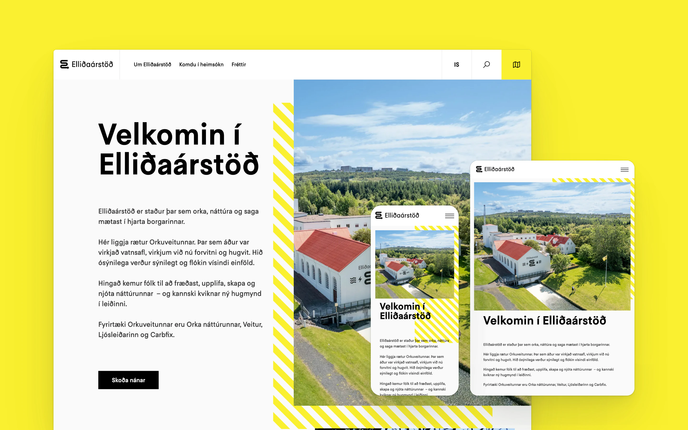
The design takes its cue from the station itself: bold L15 headings, open white space and diagonal stripes, like safety markings, framing every photograph. Each part of the homepage has its own colour, orange for visiting, blue for learning, coral for the station and yellow for news and the café, and the colour carries through to its button.
At the centre is an interactive map of Elliðaárdalur. Places are sorted into nine categories, from energy and resources to walking and running routes, history, wildlife and geology, and each category can be switched on or off. We built the site on WordPress, in Icelandic, English and Polish.
Hönnunin sækir í stöðina sjálfa: feitletraðar fyrirsagnir í L15, rúmgott hvítt svæði og skálínur sem minna á öryggismerkingar og ramma inn hverja ljósmynd. Hver hluti forsíðunnar hefur sinn lit, appelsínugulan fyrir heimsóknir, bláan fyrir fræðslu, kóralrauðan fyrir stöðina og gulan fyrir fréttir og kaffihúsið, og liturinn fylgir hnappnum.
Í miðjunni er gagnvirkt kort af Elliðaárdal. Staðirnir skiptast í níu flokka, frá orku og auðlindum til göngu- og hlaupaleiða, sögu, dýralífs og jarðfræði, og kveikja má og slökkva á hverjum flokki. Vefurinn er byggður á WordPress, á íslensku, ensku og pólsku.
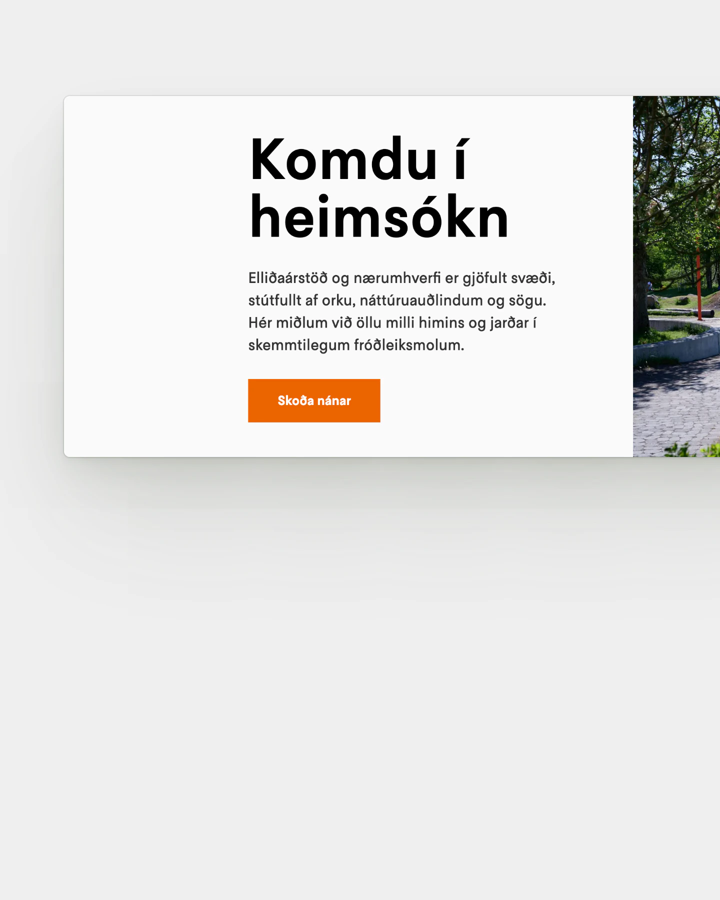
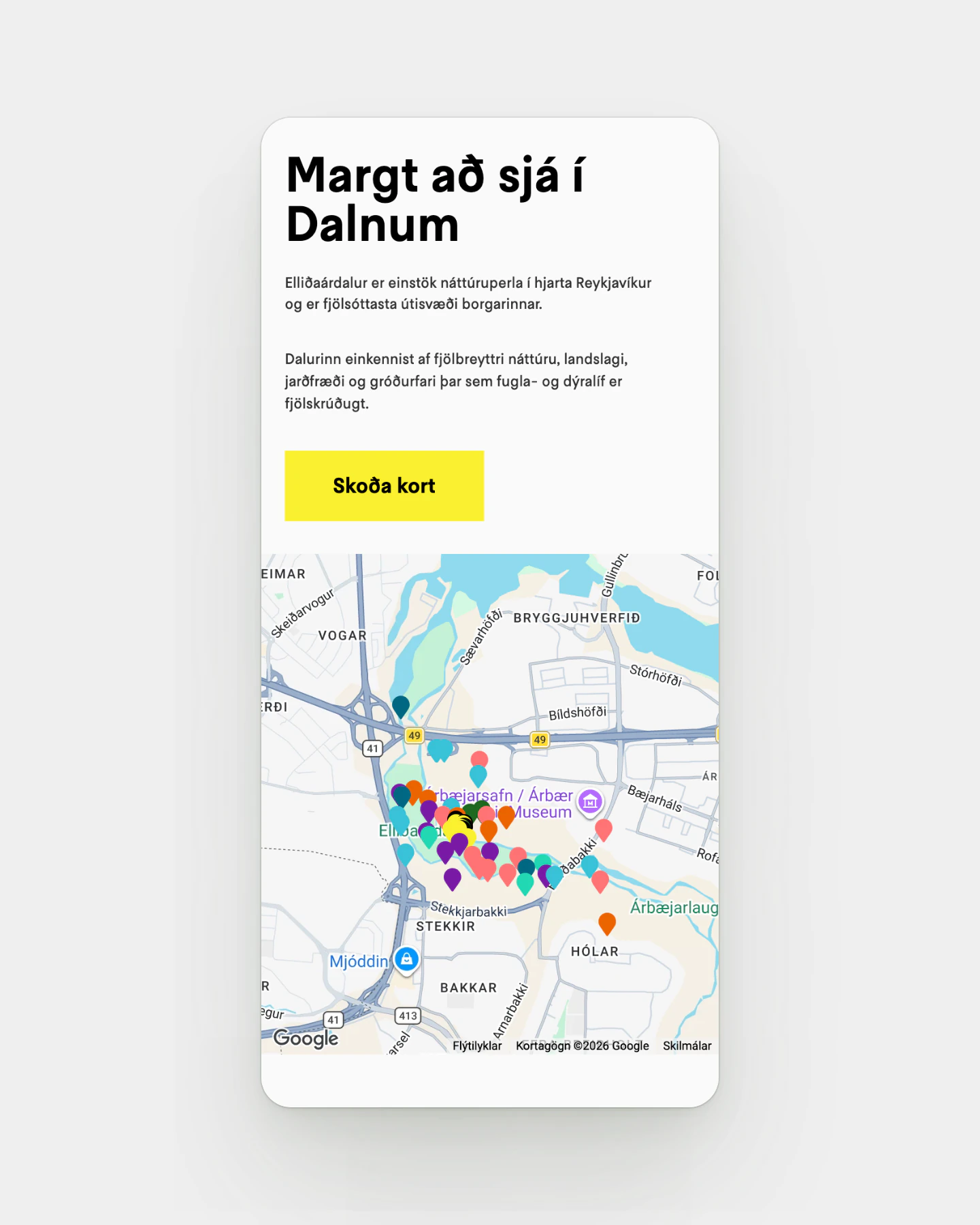
The visit section on desktop, and the valley map on a phone.
Heimsóknarkaflinn á tölvuskjá og kort af dalnum í síma.
Outcome Niðurstaðan
Elliðaárstöð now has one place for everything a visit involves: how to get there, what to see, what to teach and what is new. The map puts 58 places in the valley on one screen.
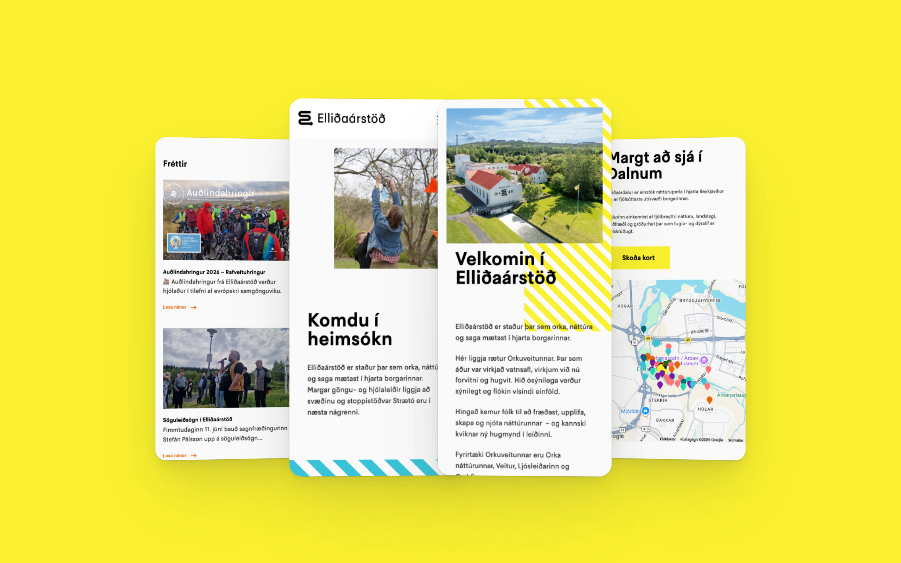
The same pages work on a phone out on the trail and on a screen in a classroom.
Nú er allt sem heimsókn í Elliðaárstöð kallar á á einum stað: hvernig á að komast þangað, hvað er að sjá, hvaða fræðsluefni er í boði og hvað er nýtt. Kortið sýnir 58 staði í dalnum á einum skjá.
Sömu síður virka í síma úti á göngustíg og á skjá í kennslustofu.
In numbers Í tölum
9
map categories, each one a switch
58
places in the valley on the interactive map
3
languages: Icelandic, English and Polish